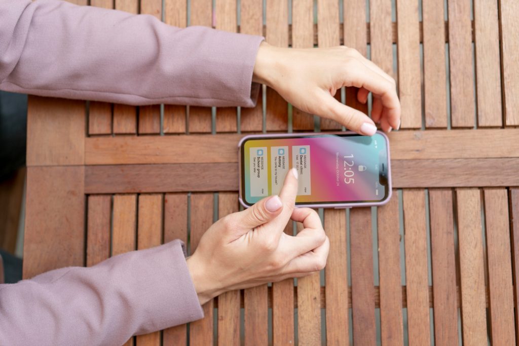
Although Apple is renowned for its minimalist design aesthetic, it occasionally deviates from this standard. Perhaps the most visually revolutionary update since iOS 7 more than ten years ago, the upcoming iOS 26 update represents such a turning point. Subtle translucency, rounded geometry, and dynamic responsiveness are Apple’s more elegant choices than flamboyant animations or dramatic color shifts.
The term “Liquid Glass,” which they are using, is remarkably accurate. Layered transparency has been added to buttons, tabs, and notification panes, allowing them to reflect colors and textures below them in real time. In the literal sense that elements appear to react naturally to user interaction, the interface feels as though it breathes—not in the metaphorical sense of fluid user experience.
| Feature | Details |
|---|---|
| Update Version | iOS 26 |
| Codename | “Liquid Glass” |
| Visual Style | Translucent UI, rounded corners, depth-based dynamic elements |
| Customization Options | Home/Lock screen tinting, 3D wallpapers, adjustable opacity |
| Ecosystem Integration | iPadOS, macOS, watchOS, CarPlay unified with consistent visual design |
| User Feedback | Mixed; transparency concerns addressed in iOS 26.1 and 26.2 |
| Design Inspiration | Derived from Apple’s Vision Pro interface architecture |
| Initial Reveal | WWDC 2025 (anticipated full rollout in fall) |
| External Reference | https://www.bloomberg.com/news/articles/apple-readies-dramatic-software-overhaul-2025 |
This goes beyond simply giving the iPhone a makeover. Apple is indicating a unified design push that improves device fluidity by coordinating the visual experience across iPadOS, macOS, watchOS, and even CarPlay. The consistency is especially helpful for users who are juggling several Apple products. When viewed on your Mac, a message that was started on your iPad appears and feels almost exactly the same.
Simplified navigation is the most noticeable change. Users now see only two primary options—Photo and Video—at launch in apps like Camera, where modes used to clog the top and bottom of the screen. The remainder operate in pop-outs, which lower friction and maintain screen focus. It’s a minor change that has a startlingly significant impact on daily use.
When I tested the beta on an iPhone 15 Pro Max, I first became aware of the effects of these improvements. The updated Control Center felt like a subdued call to action, floating above your wallpaper like a translucent card. It was soothing in addition to being lovely. That may sound sentimental, but this was different from iOS interfaces that valued clarity over emotion for years.
Everything is now dominated by rounded corners, including widgets and system buttons. Apple has adopted a pill-shaped design that reflects the company’s hardware philosophy. Although it might appear to be a small aesthetic change, it visually complements Apple’s larger industrial design and strengthens the impression that hardware and software are speaking the same language.
Perhaps more intriguing is how much control Apple is returning to its customers. Following early readability complaints, iOS 26.1 and 26.2 have new sliders that allow you to change contrast and transparency levels to fit various settings. This move toward flexibility is especially novel for both design purists and accessibility advocates.
Additionally, Apple has added dimension to wallpapers. With the help of a new feature, users can add subtle 3D motion to images, creating a layered parallax effect that changes with device tilt. Although it’s simple to write it off as decorative accent, it adds a playful element that has been lacking.
The most notable aspect of this interface change is that it is not limited to phones. With macOS 16, the Mac will follow these same cues, and the iPad will do the same. That alignment is very effective and not just aesthetically pleasing. With far fewer inconsistencies, developers can now create visuals once and scale them across platforms. In actuality, Apple is simplifying the development process as well as the user experience.
This timing is also part of a covert strategy. Apple is probably using this redesign to pique consumer interest after weaker iPhone sales during the previous holiday season. Upgrades are encouraged by new designs, even if the hardware is still relatively new.
Many users yearned for interfaces that calmed rather than stimulated during the pandemic, when routines broke down and screens became lifelines. Though in a more sophisticated way, this move toward harmony, depth, and transparency seems to reflect that idea.
I was impressed by the new Weather app’s use of transparency to reflect the current color of the sky. Though it’s a minor detail that’s hardly noticeable unless you’re looking closely, it shows how obsessed Apple is with environmental responsiveness.
Crucially, the new design establishes the groundwork for spatial computing as well. With Vision Pro having an impact on iOS 26’s layout and material design, Apple is laying the groundwork for a time when mixed-reality interfaces will be extensions of current products rather than stand-alone offerings. In the upcoming years, that continuity might be Apple’s greatest competitive advantage.
Not everyone is persuaded, though. Translucency, according to some beta testers, detracts from readability, especially in bright light. Apple’s latest updates, which include toggles for contrast enhancement, appear to recognize this. It serves as a reminder that functionality cannot be sacrificed for elegance.
Apple has improved the expressiveness and manageability of its interface by streamlining interactions and optimizing opacity controls. This new approach feels like a well-considered compromise to those of us who once embraced skeuomorphism before discovering that flat design was the way to go. It is grounded, lovely, and responsive rather than nostalgic or drastically futuristic.
And given the current state of digital fatigue and UI overload, that may be precisely what users require. Apple isn’t merely introducing a new user interface. It’s redefining what digital surfaces should feel like, less like screens and more like extensions of our perceptions, movements, and thoughts.

